CULT COMICS
This logo was developed for a comic book and pop culture outlet using printing dots and a classic call out text style. From simple sketch to fully realised design this logo was created using a combination of pen, paper, Photoshop and Illustrator.
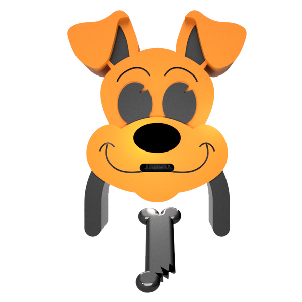
THE FAR FEEDER
The far feeder was designed as a way to connect owners and their pets over long distances and make this connection more enjoyable for all parties. The design is made of 2 components, the feeder and the dispenser. The dispenser houses the food and a pressure plate at it’s base. When a pet stands on the pressure plate a signal is sent to the feeder. The feeders nose glows and the pet’s owner knows the pet is hungry. From here the owner inserts a small bone into the feeders mouth, large side for a lot of food, small side for a little food.
GRASS FONT
A decorative font designed to look like blades of grass. This typeface consists of every lowercase and uppercase letter along with all the most used symbols on a keyboard.
TYP MAG
Typ Mag was a magazine based around how typography is used in industrial design. I was editor of the magazine and responsible for the graphical layout of the piece.
CODING
Using HTML and CSS code this basic website portfolio was coded from scratch to showcase my work on mobile devices. Coding was also used to create a variety of small interactive works to show how code can be used to generate design experiences.
IMAGE ANALYSIS
Understanding the theory behind visual designs is also a key part of my visual design toolbox. Through analysing famous works and understanding them I am now better able to understand how to utilise these theories in my own works.


